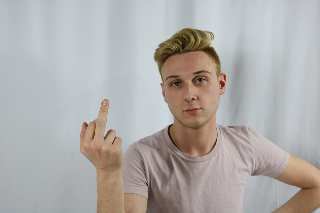
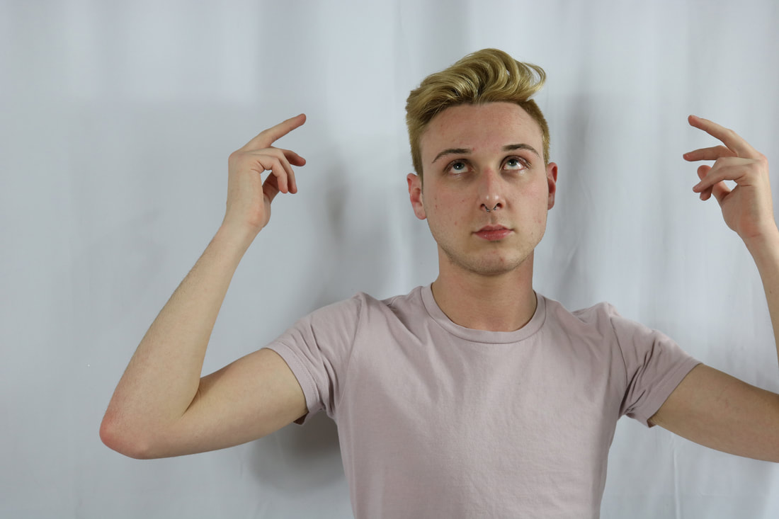
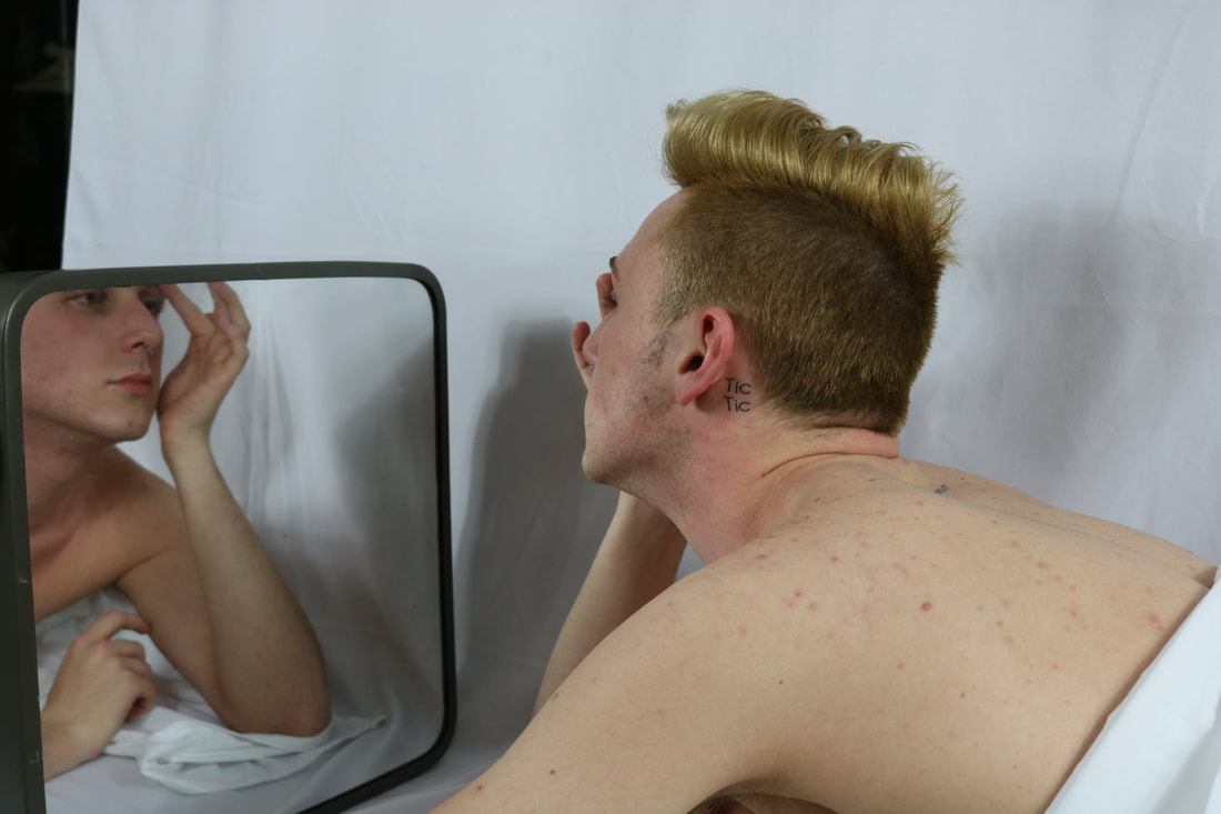
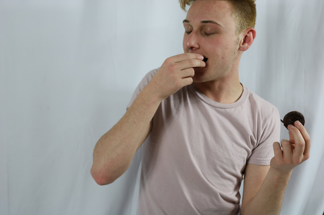
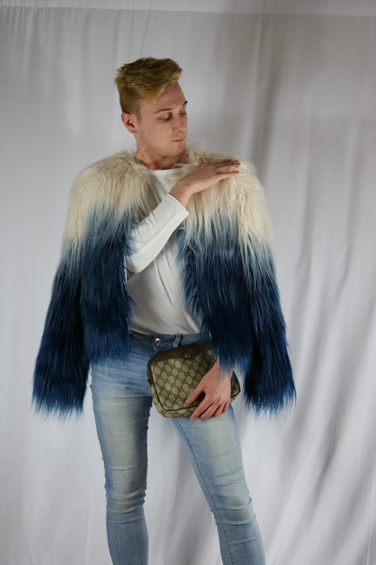
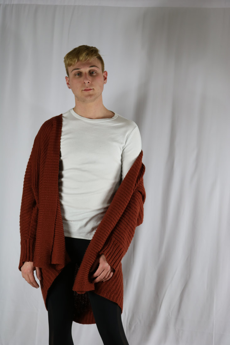
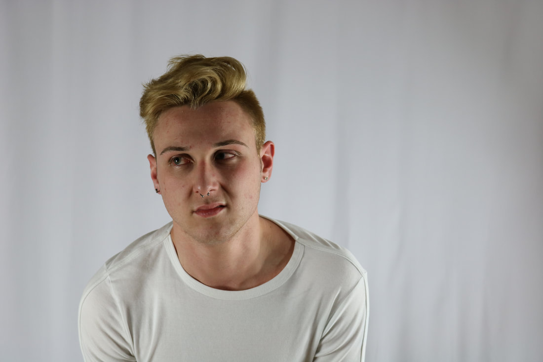

my first series is portraits based on the seven deadly sins. I have started off with one portrait each sin and plan on adding more. I have also played with the idea of doing the seven virtues to contrast the sins. Each photo represent a sin : photo 1 and 2- anger, photo 3- pride, photo 4- gluttony, photo 5- greed, photo 6- sloth, photo 7- envy, photo 8- lust. I believe pride and the first photo for anger are really strong. The mirror adds something to the photo that makes it more interesting and not just a normal portrait. Photo 1 the model has a very strongly portrayed emotion that is showed even with out the hand gesture. The photo has a perfect white balance, with no yellow or blue tones to distract from the subject. The photo has a lot of voice and emotion even if it were by itself and not part of a series. His face is on one side of the thirds while his hand is on the other which creates balance. It also kind of follows the rule of thirds. The weakest photo would have to be envy. It was hard to come up with an idea to have him look envious without other people in the photo. If the photo had other people in it, it could be a lot stronger.
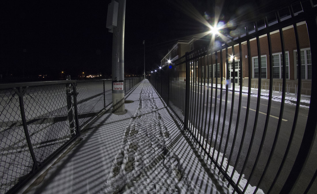
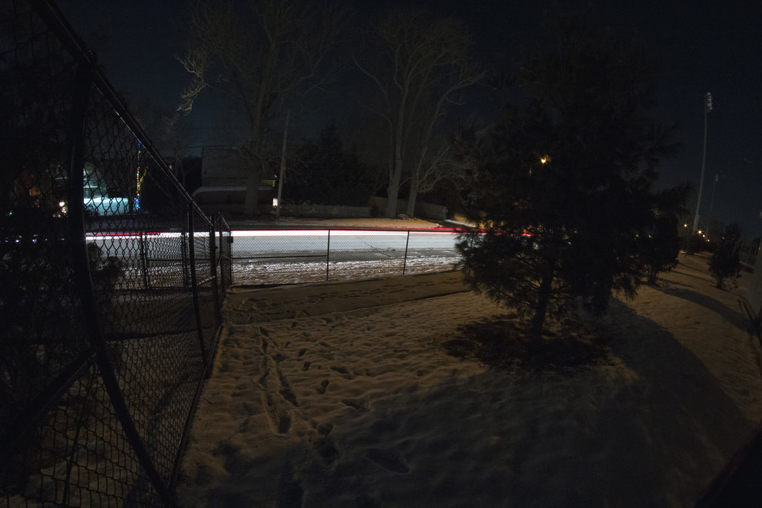
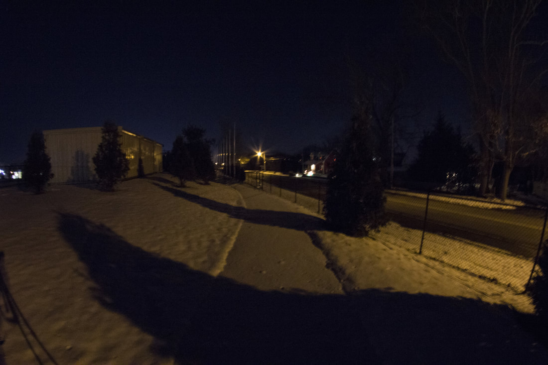
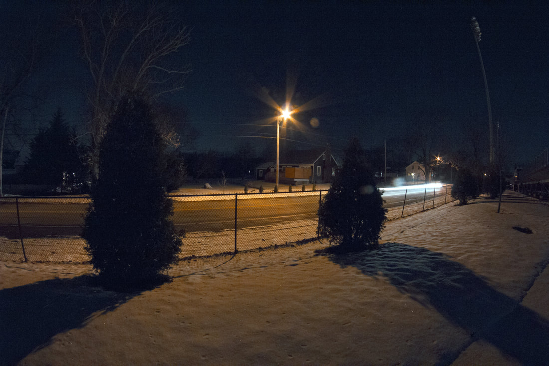
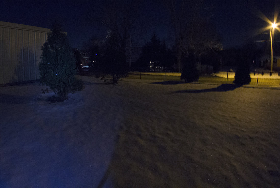
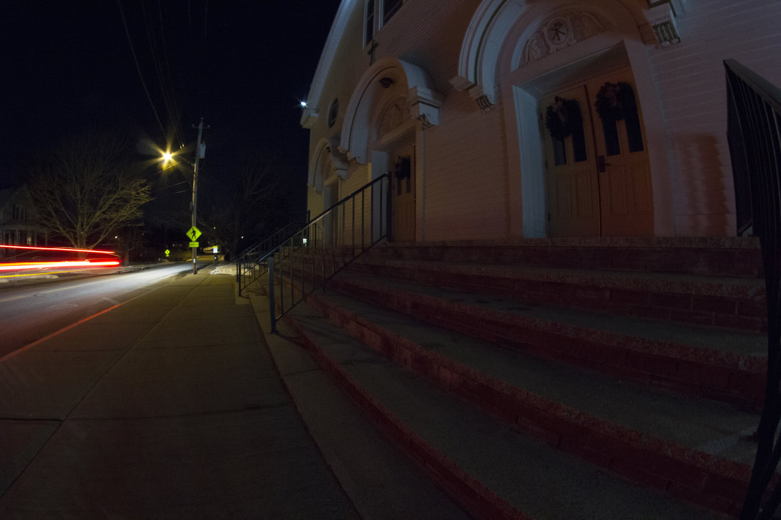
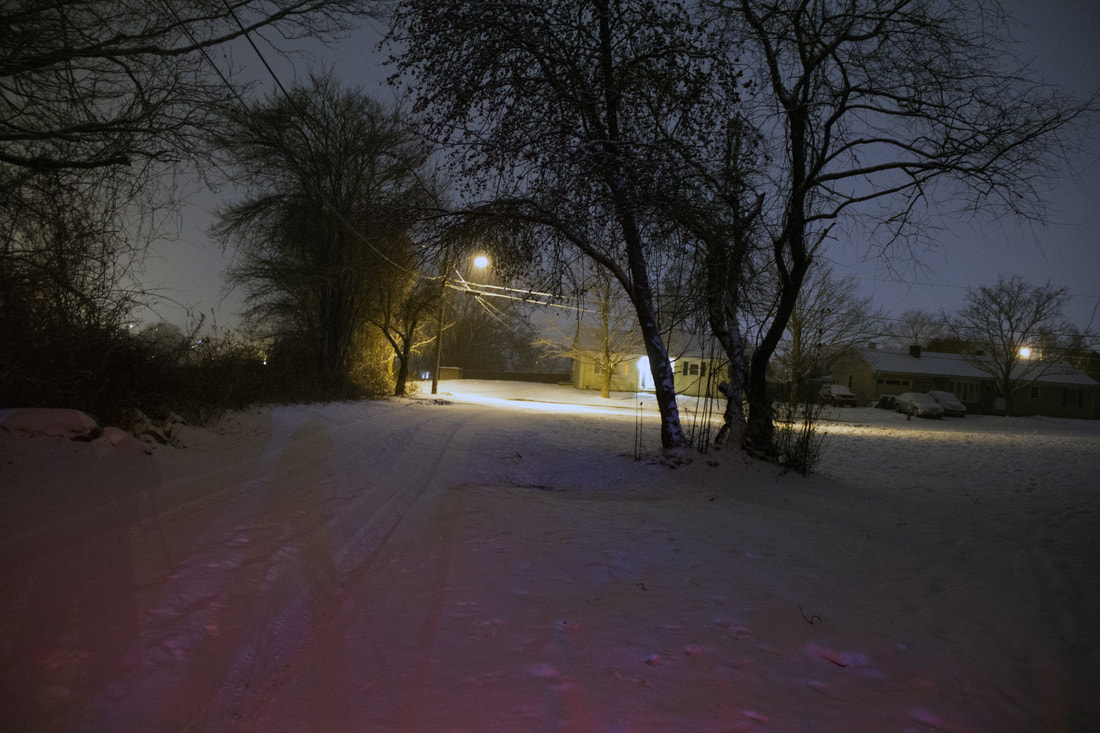
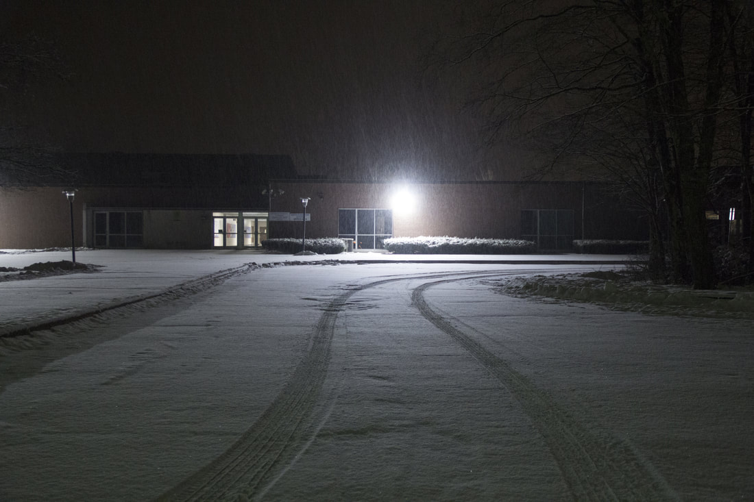


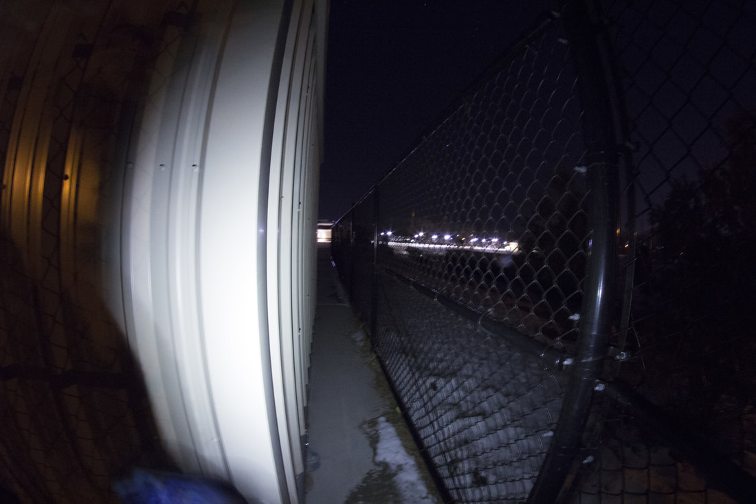
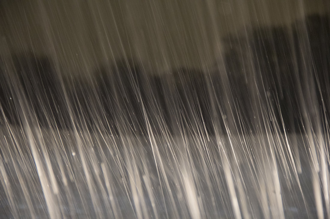
In my series I took all my photographs at night, and after it had snowed. I wanted to focus on lights from street lights and outside buildings. I used a wide angle lens for most of the photos. In photo five I have a strong contrast of the blue light and the yellow street light . In photo eight the tire tracks are leading lines that bring you around the photo, the light also is off center in the photo, but in the center of the tire tracks. The focal point of photo nine is very bright and in focus drawing your attention right to it. These photos were more of a technical exploration for me rather than a narrative. All together these photos are a mix of strong and weak. The strongest would have to be 6,8, or 9. Photo 9 is probably my favorite of the three. It has a very defined focal point and is very simple. The flair of the light right above the headlight adds a bit more to the photo so it doesn’t look like someone just took there phone and took a picture of the car. Since this is not a narrative I don’t believe there is much voice in the photo. The weakest would have to be 3,4, or 11. Photo four is very grainy and yellow. Out of the set this would have to be my least favorite. I’m not quite sure if it is the yellow tone from an incorrect white balance or the bend of the tree from the wide angle lens. Technically and compositionally it is not very strong. To change it I would use a deifferent lens and choose a different WB setting.
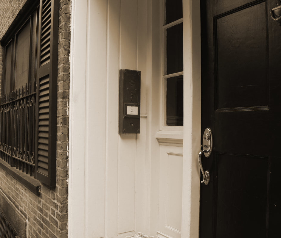
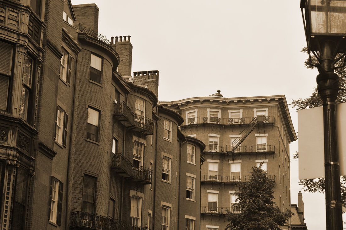

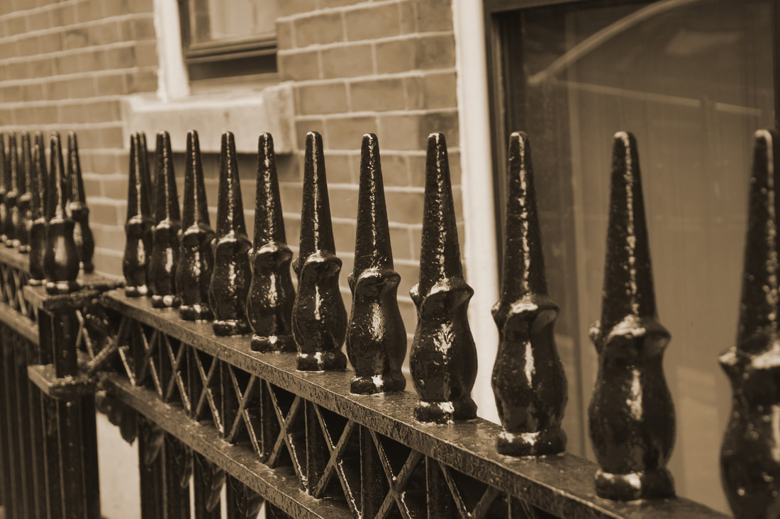
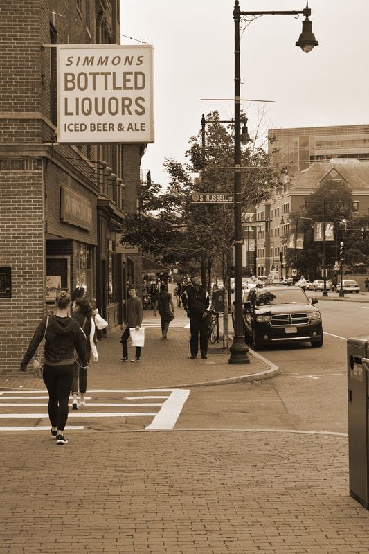
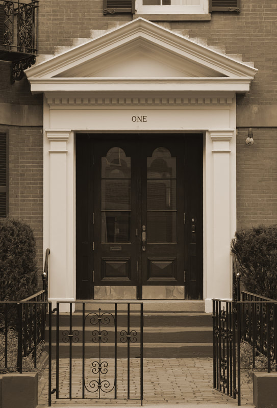
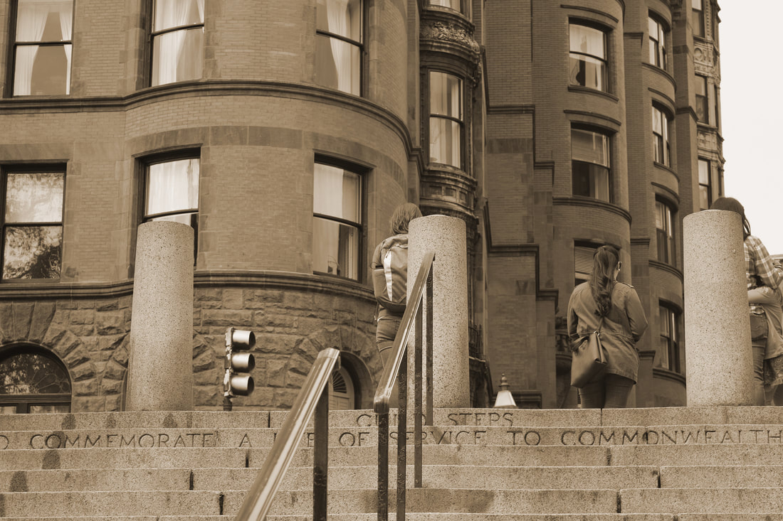
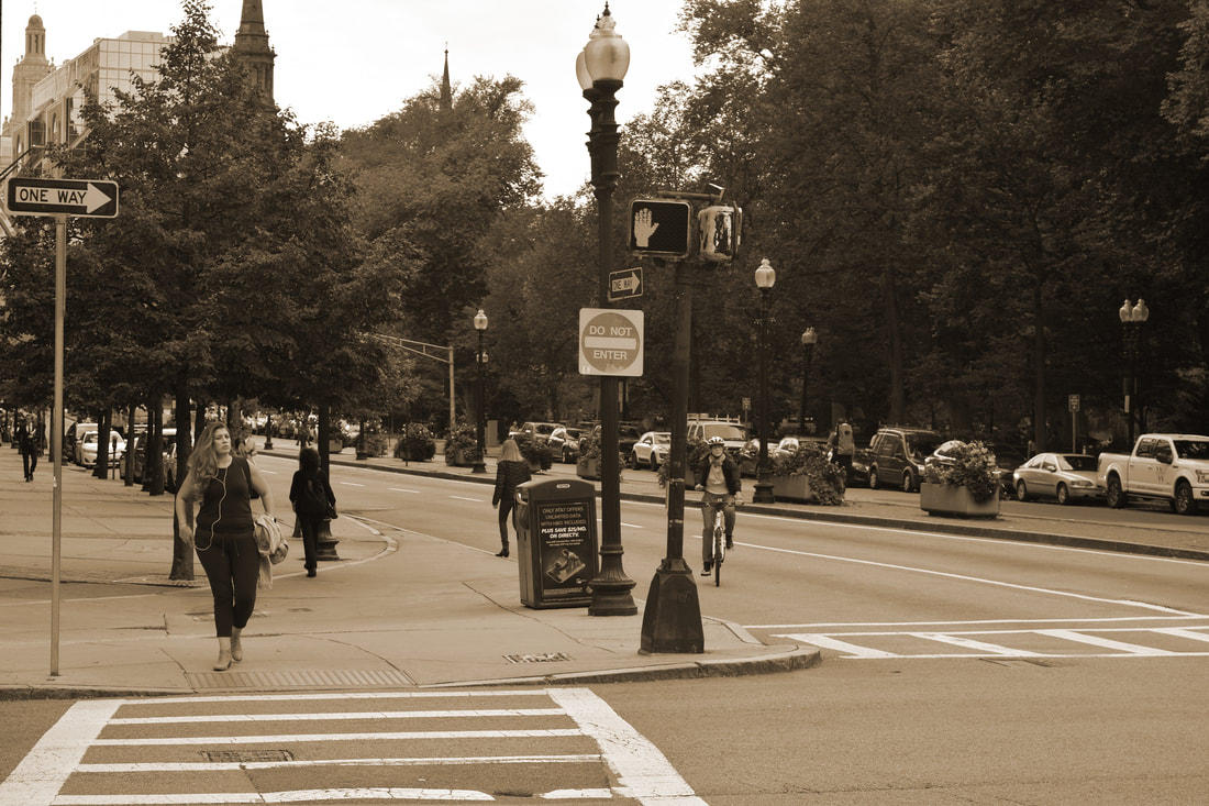
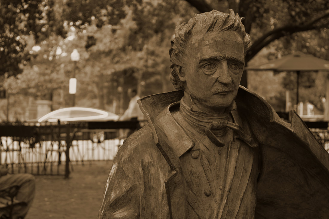

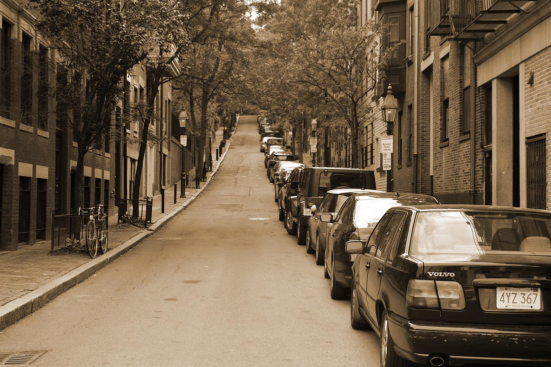
In My concentration is photos taken in Boston MA. All my photos are of buildings, statues, and cars. The people in the photos did not know that I was taking photos that they were included in. The sepia tone adds an element of oldness and and unity. Boston is a very historic city, so I believe it is appropriate to have a filter to make the photos look older. The sepia unifies the photos as a set and makes the photos look older. My concentration shows the new, but with a hint of the old. The buildings are older but seeing it with the newer cars and how people are dressed are contrasting but work well together. In slide five I show my understanding of the use of repetition. I also show that I know the concept of focal point in slide nine. In slide seven I show my knowledge of symmetry. My strongest photo is photo one. The photo is very crisp and clear and clearly shows the little details. I’m not sure if it has voice, but it could be set in modern times or the past because there is no evidence it is based in one specific time period. The sepia is not too over powering in Thai photo either, it is not too yellow, but it doesn’t look normal either. I believe it does engage the viewer because your eye starts at one point and can make its way around. I’m sure people have gone and taken pictures of front doors in Boston but I still believe this photo is original. My weakest piece is probably 10. To me it looks like the sepia is too heavily saturated and dark. The photo was dark to begin with so the monotone did not help that. If I were to redo this I would have a higher exposure and would also clean up the background of the cars. It seems maybe a tad too modern to be in this series.
