concentration ideas
for my concentration I would like to focus on location. I could do all outdoor photos of a specific place, such as one town or state. I could also do nauture versus city area, trying to find images that have structure as a comparison. I could also do all outdoor cyanotypes located near the water.
artist hero


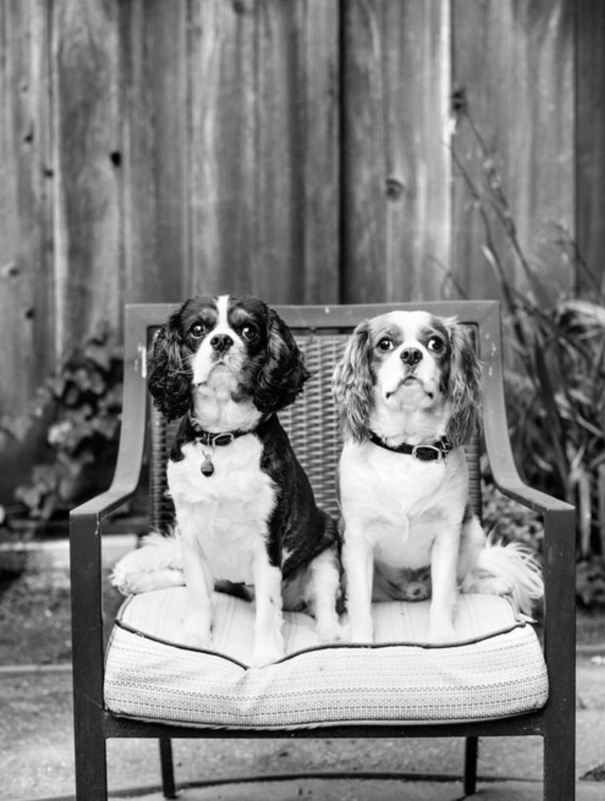
My artist is Jesse Freidin, from Massachusetts. These works are of animals, specifically dogs, and he likes to focus on their bonds with people. These are some of his more recent works, he does work for galleries and private sessions. The setting is a laid back environment where the animals feel comfortable, sometimes even in their homes. The images are all in black and white. The last image of the two cocker spaniels is my favorite. The black a whites have a large range of values in this piece. The two subjects are different in color creating strong contrast, but also unity because they are of the same breed. The piece is unified because the two dogs are very similar. However their is variety because they are not exactly the same. There is slight symmetry right down the middle of the work vertically. The piece is very realistic, it gives the viewer a feeling of comfort. It also has slight sense of humor in the work. I think the artist is trying to show how the two subjects are brothers, even though they are different they are close. I like the strong range of the black and white. There is not too much dark color or light colors, but there is a happy balance between the two. I do not believe this is an important part of art history. However, it does fit into the time period it was created. I do not believe this work has influenced others.
museum vist 1

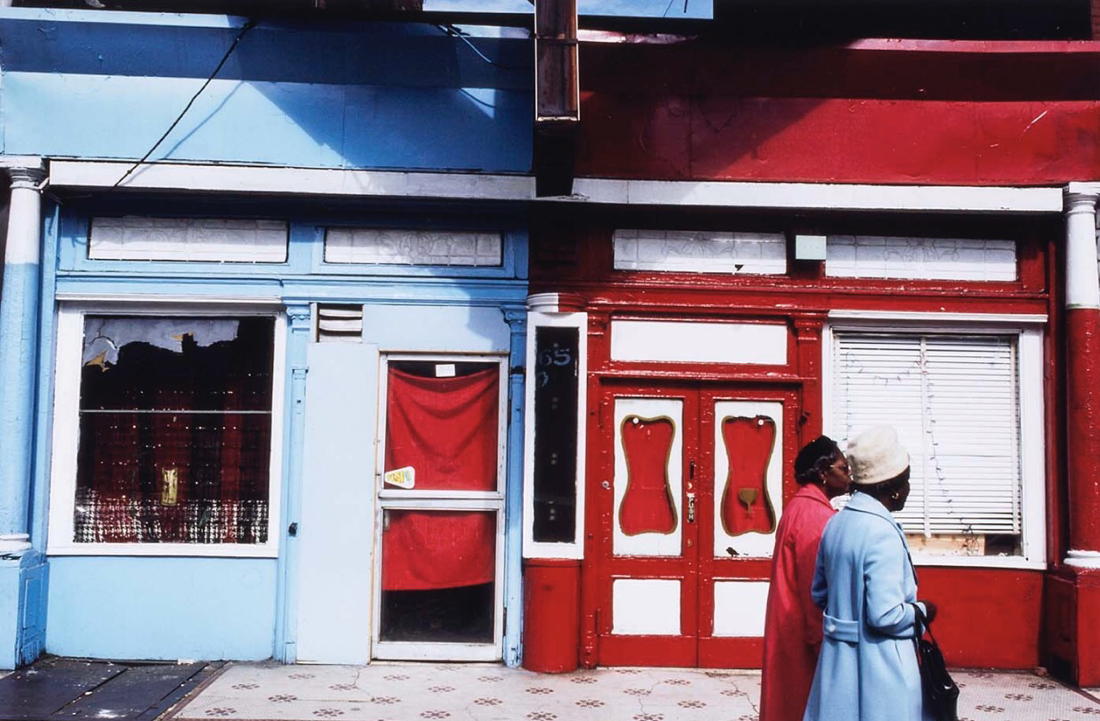

For my first museum "visit" I chose an online gallery. The exhibit I looked at is called Down these Mean Streets: Community and Place in Urban Photography. It unites the work of 10 photographers. The work I will be talking about is the second image, formally named 65 East 125th Street, Harlem. It was created by Camilo Vergara. The photo was taken in 1980, and is 11.5 inches by 14.25 inches. The photo was taken in Harlem and is very additive with color. The subject of the photo is the two store fronts and the ladies in front. Color is a very strong part of this piece. Texture and value also play a strong role in the piece. The buildings and the women are both red and blue. The colors create a sense of emphasis. The piece is realistic but has an abstract vibe because the coats and buildings match so perfectly. The red in the piece stands out to the viewer and the blue keeps the viewers attention and leads their eye through the photo. I feel calmed when I look at this picture because my eye keeps flowing through and looping back to where I started looking. The mood of the work is unity. The buildings and the coats match perfectly and are unified. The work tells a story of friendship, the two women I front look close. The artist did lots of street photography and was at the right place at the right time. I like this piece, however it seems too perfect. By itself I do not think this should be extremely important in art history, it could be made stronger as a series. The piece was taken in 1980 which was a time of bold colors, which is reflected in this work. The work has not had any influence over any well known works. The title does make sense, it is the address where it was taken.
series 1
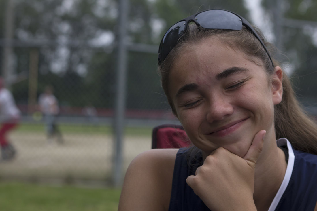
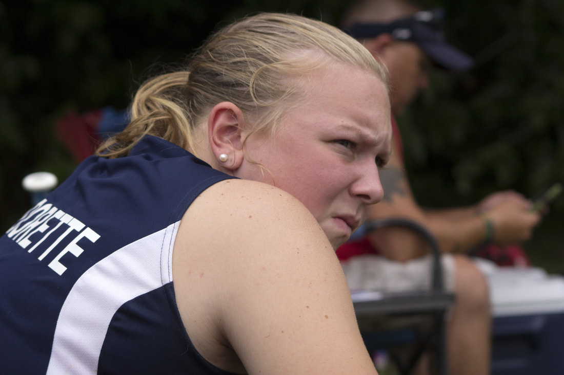
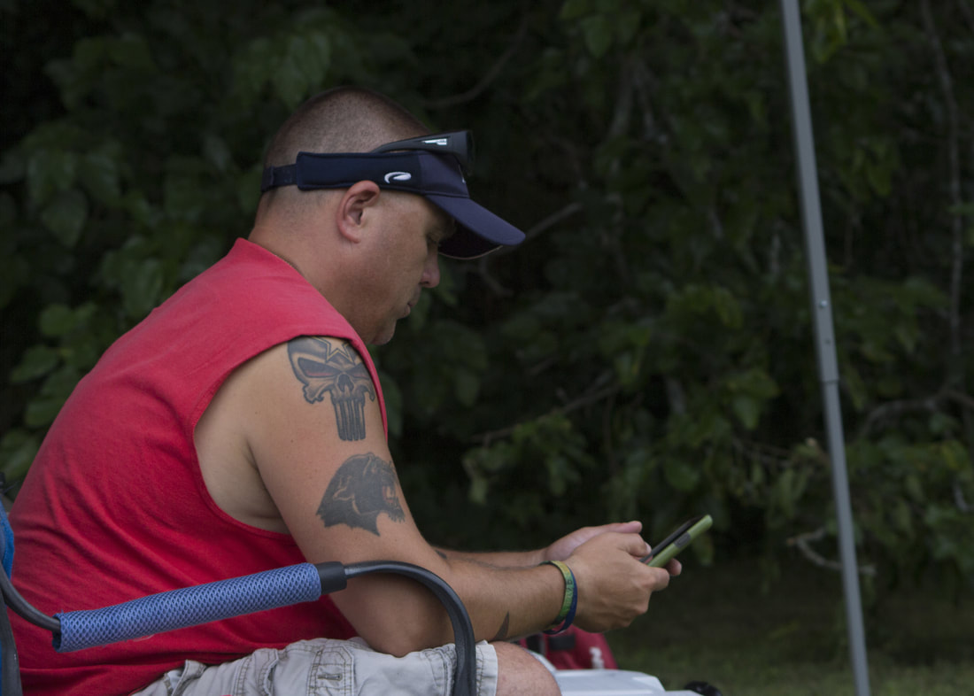
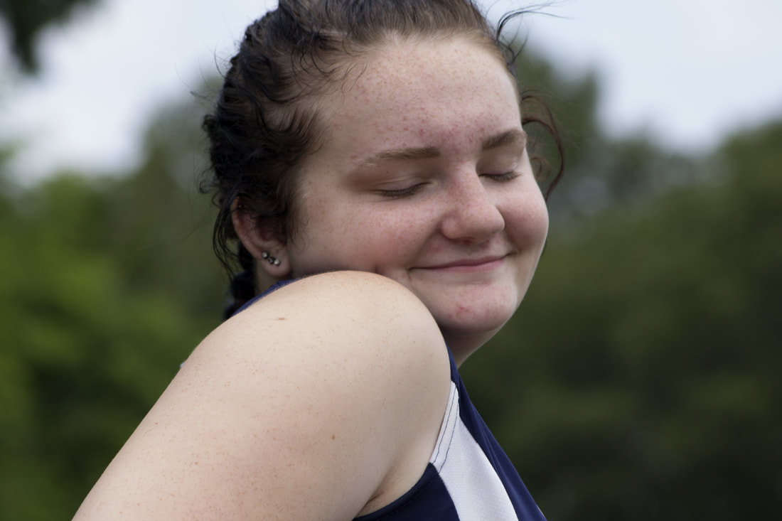
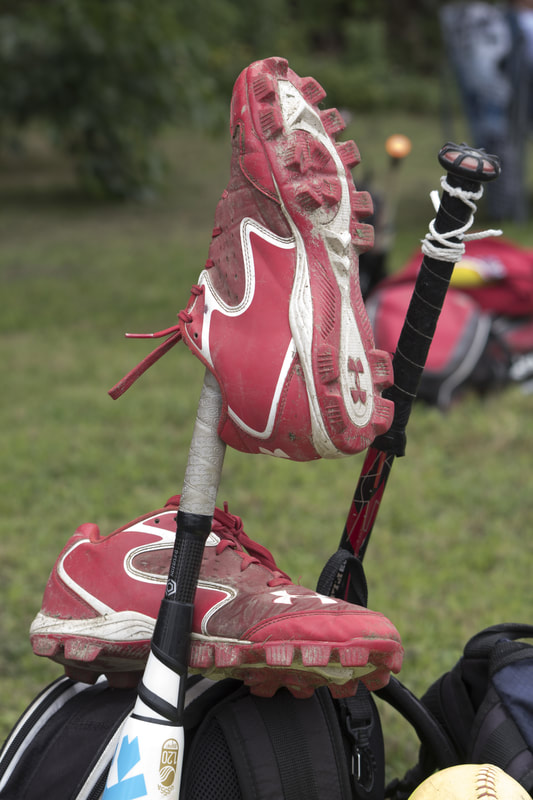

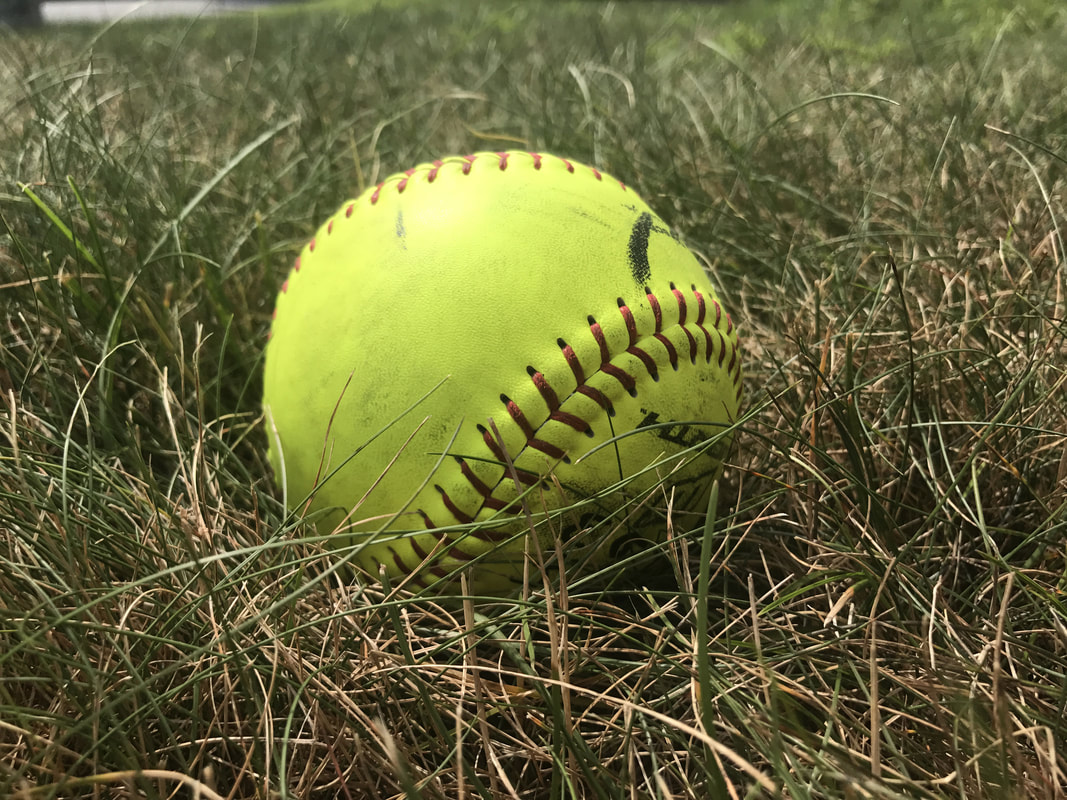
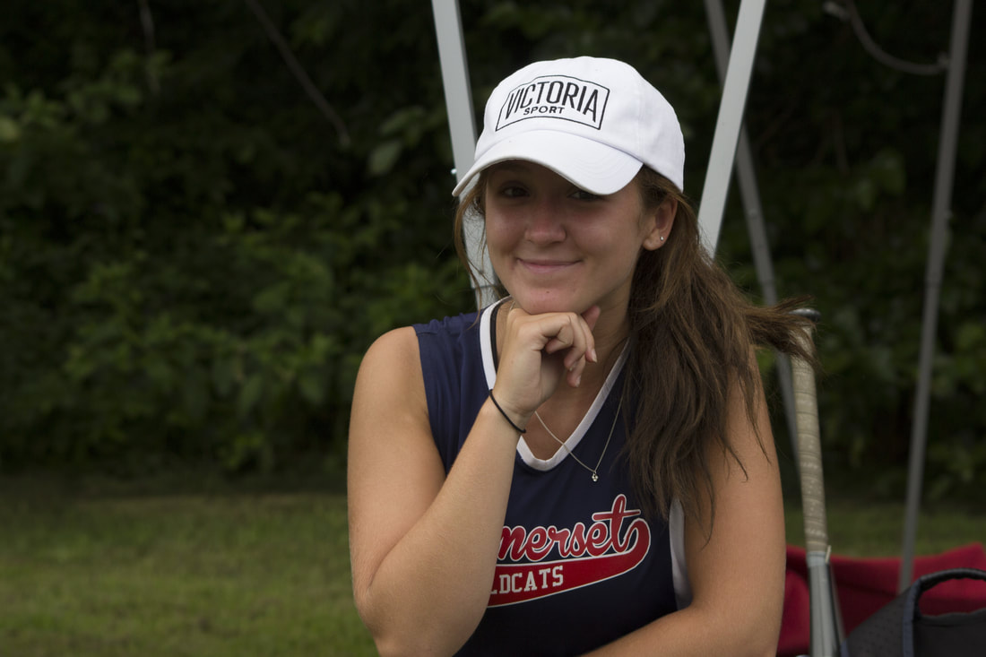
My series is of my day at the softball field when I was in New Hampshire for a tournament on July 8th. My team and I had won our first game and were waiting to play our second, so we watched what ever game was on the field we were playing at next. My favorite photo from the series is the cleats on the bag. There is a lot of red in the photo; the bat, the shoes, and the blur in the background all are generally the same shade of red. The pictures I took of my team mates were being taken without them knowing at first, but once they figured it out they insisted to pose for the project. I also got a picture of one of the parents updating others on how we were doing.
artist hero (2)
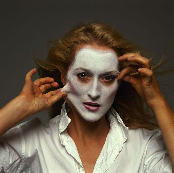

for my second artist hero I chose to write about Annie Leibovitz. The work I am focusing on is a photo of Meryl Streep. The photo was taken in 1981, it was on the cover of Vanity Faire on October 15th of that year. The work is a photograph. I was unable to find the exact dimensions of the photo, but it was printed on a magazine cover. The picture was taken in a studio with a gray backdrop. The picture is of Meryl Streep trying to take off the makeup on her face. I believe it means that she doesn't need any of the extra face work because she is proud of who she is. There is white paint on Meryl Streep's face, and she is also wearing white. The contortions in her face are showing that she is taking that makeup face off. The crispness of the image lets the viewer see all of the wrinkles in her shirt and waves in her hair. The subject is in the center and there are no distractions things in the background. This makes it easier for the viewer to focus on how she is posing. The photo is a little dark, but I think it adds to the photo positively. The photo also has a sense of movement with the way her hair looks like it is blowing in the wind. The piece is a realistic portrait. At first I felt a little confused about the piece but after looking at the piece I got a feeling of elegance. I think the piece is suppose to make the viewer think about what it is about. The work has a serious tone. I think the work is showing how no one needs to look perfect with makeup and always dressing up to impress someone. I think Annie wanted to give a message about self beauty without saying it outright with words. I like the piece, because you have to actually think about it, and the meaning isn't just thrown at you. This is an important part of art history, not just this work, but all of her portraits. The bold colors fit in with the 1980s. Annie made bold lighting and pose choices that have influenced other photographers.
mueseum visit
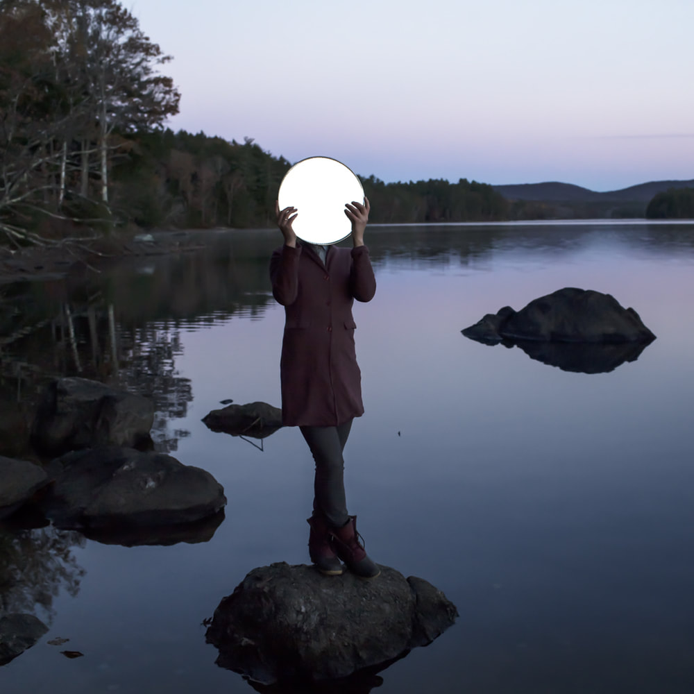

For my second museum visit I found an online gallery of work by Cig harvey. My favorite photo from this set is of the girl on the rock holding a mirror. Sadie and the Mirror, is the title of this piece and it was created in 2013. This photo was taken on a pond in the evening. The subject is holding a mirror and the sky is reflecting off of it. At first I thought it was a hole in the photo, but with a second glance I saw it was a mirror. I like all the soft colors, especially all the blue and purple tones. I also like how the trees are not a bright green, so as not to distract the viewer from the subject. I think that the bright white circle really draws the viewers attention to the middle of the piece then flows freely through the rest of the piece. The piece could be a way to express the girl wanting to hide her face. I do like this piece and its concept, however the bright white does looked photo shopped. The title makes complete sense because assuming her name is Sadie, it is a literal title.
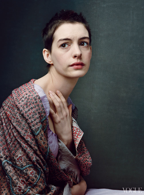
artist hero
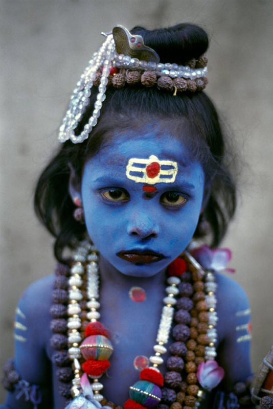
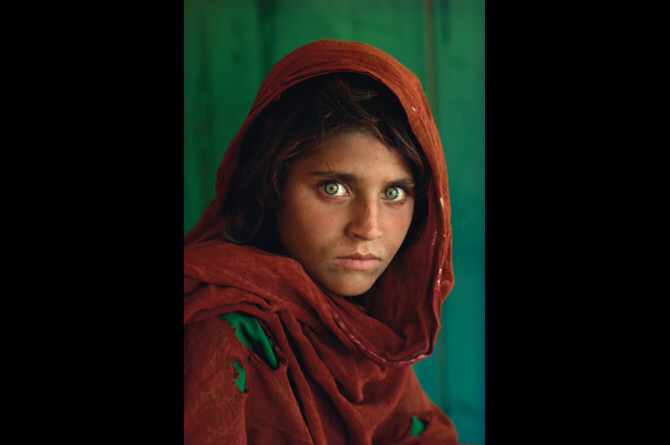
The photo was taken in 1984 at a refugee camp in Afghanistan. The photo was on a National Geographic magazine cover for the June 1985 issue. The photo was taken on a Nikon camera with Kodachrome 64 color slide film. The colors on the photo are very vibrant. Her red head scarf against her light green eyes is pleasing to the eye. There is a lot of detail in the piece making it look like you could touch the photo and feel everything in it. Her eyes are very intense and have a hint of sadness. This is an emotion evoking piece. Depending on who views it, it could make them feel many different things. When I look at the piece I feel the intensity of her stare and feel as though she is giving you access to her story of her life in the refugee camp. This work tells a story of how hard her life has been. The artist is a social journalist so he was trying to send the message of refugees like herself. I do like this piece, and believe it is an important piece of art history. The piece is showing a refugee who fled Pakistan at a dangerous time. The title is quite literal, it shows an Afghan girl which is what it shows.
photo series


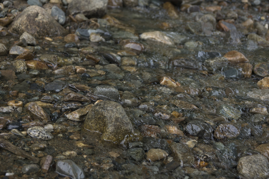

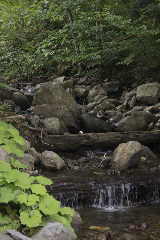

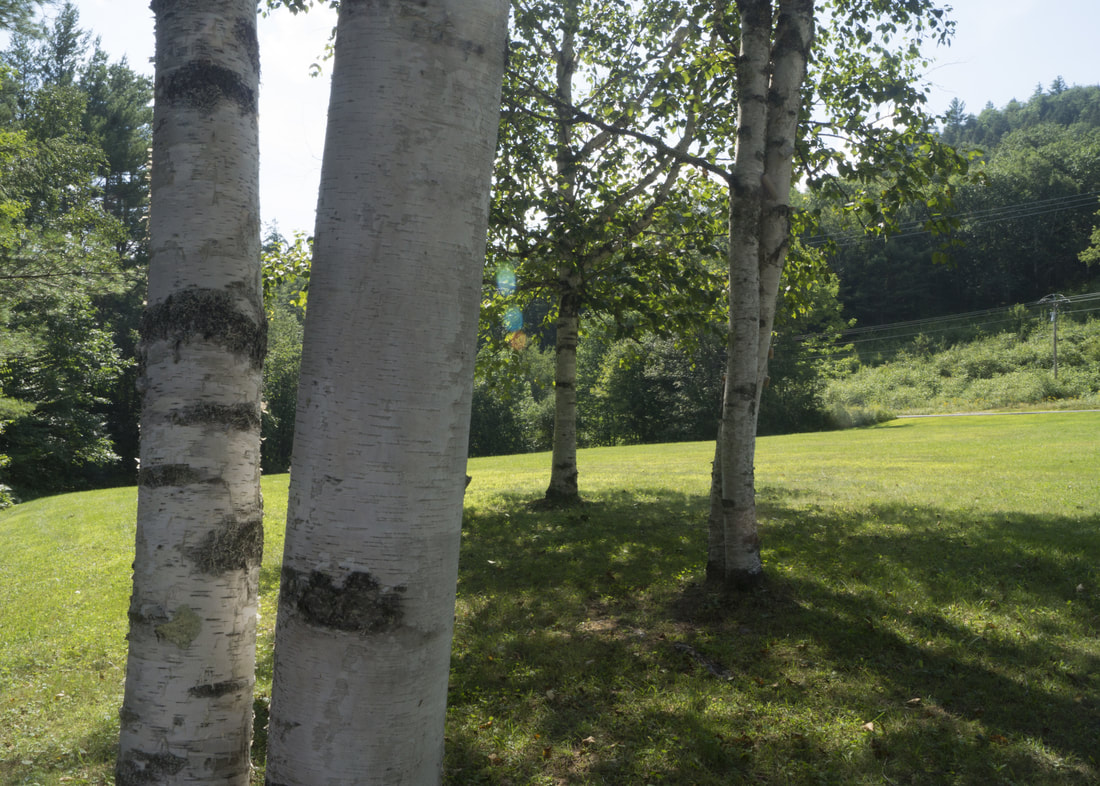
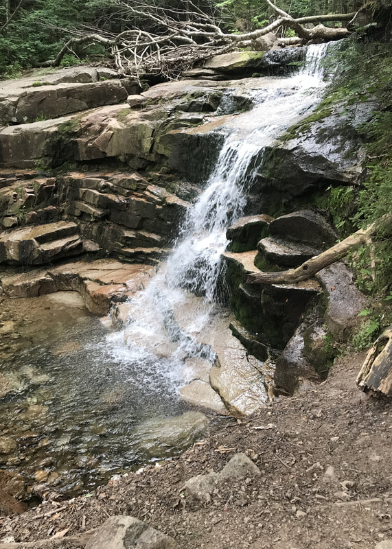
All these photos were taken in New Hampshire. I went camping with my family for eleven days in North Woodstock. The photos of the Animals and my brother going down the ladder were taken at the Polar Caves in Plymouth. My favorite photo from the set is the running water over the rocks. I like all the colors and how the image is naturally distorted by the water.
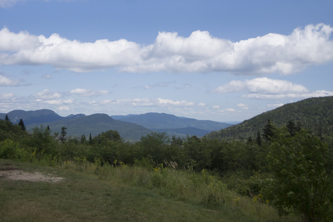
photo series 3
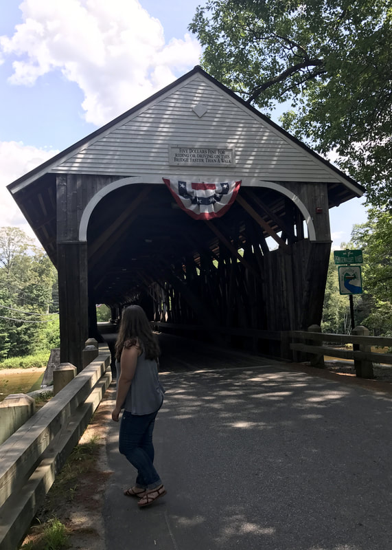
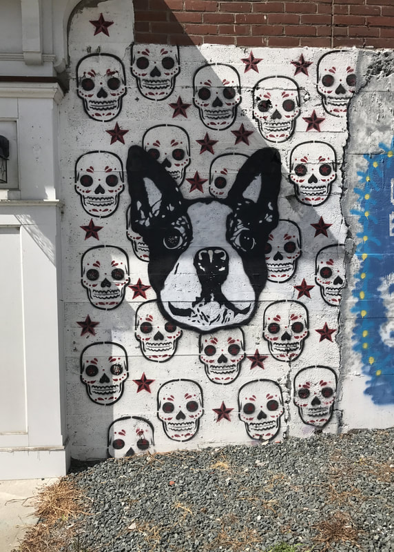
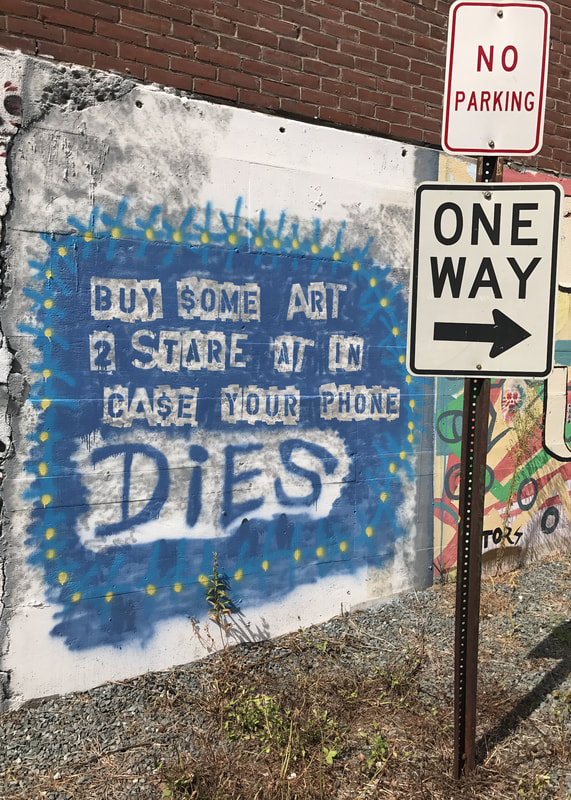
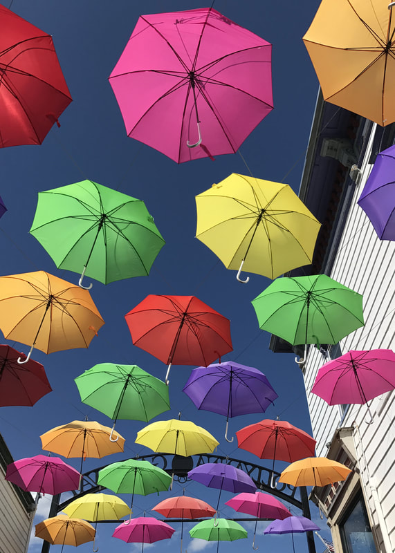


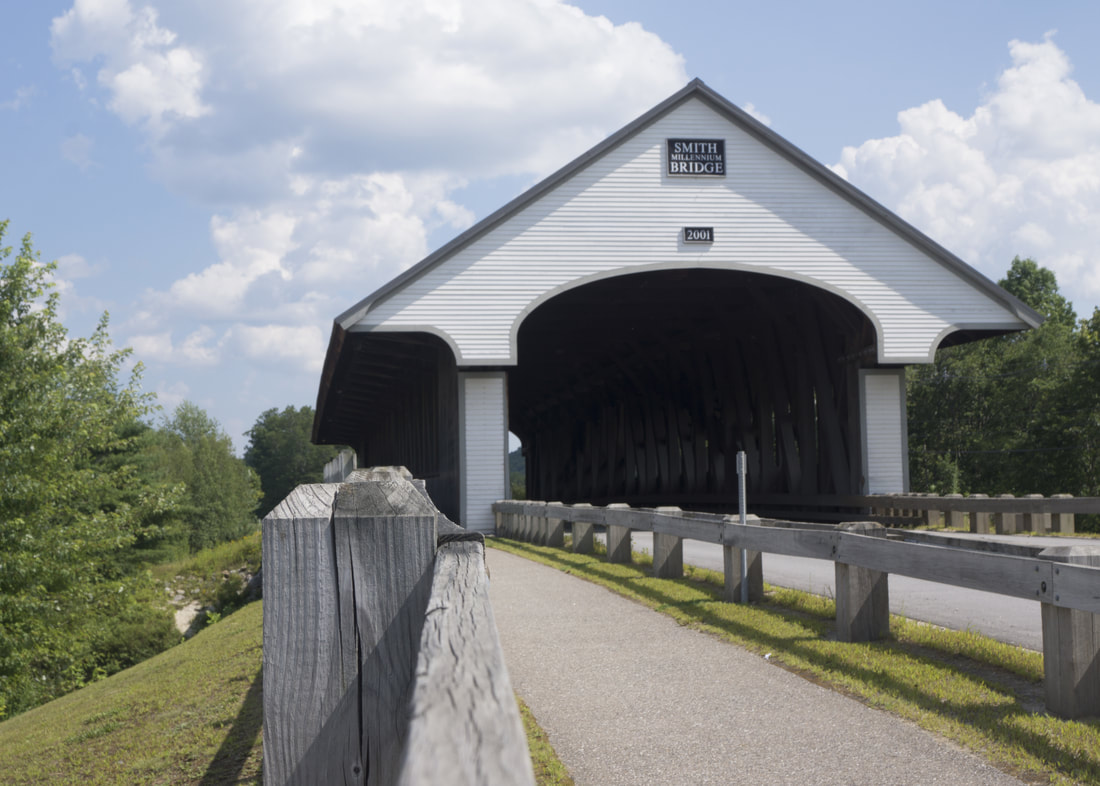
My third photo series is more pictures from New Hampshire. However, most of these were taken in the town of Littleton. In Littleton there are lots of little stores and mainly mom and pop shops instead of chain stores. two of the photos I took were also from the day i took my senior pictures, I wanted to take them on a covered bridge, so we visited a couple.
